
01 · Today
Your welcome email
It sounds like you, and the offer is generous. It just makes people work to find it.
 1
2
3
4
Scroll inside the phone
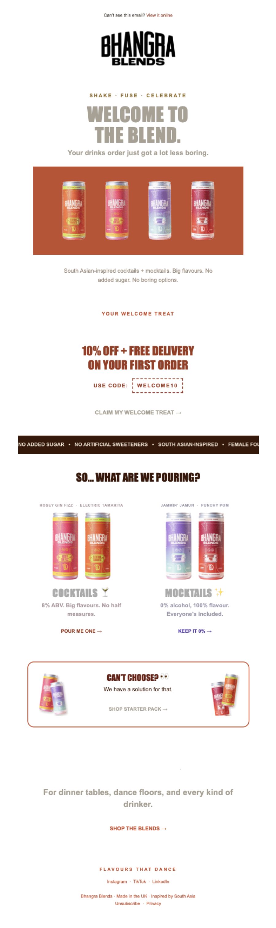
- The headline is pale grey on white. The one line everyone reads is the hardest one to see.
- The cans are small packshots on a flat block. Nothing tells a new subscriber what any of them tastes like.
- The code sits in a small dashed box. 10% off and free delivery is a strong offer, and it's easy to scroll past.
- There isn't a single button. Five text links compete with each other, and the flavours come in pairs with one link per pair.
Worth keeping The voice ("Your drinks order just got a lot less boring") and the split between cocktails and mocktails.
02 · New
Welcome email, rebuilt
Same offer, same brand. It opens on what people were looking for when they found you, then gets out of the way.
 1
2
3
4
Scroll inside the phone
- It starts with a search. "Mocktail that isn't boring" is something your customers actually type, and the can is the answer.
- The code is impossible to miss. A full-width pill with one button under it that applies the discount for them.
- Every flavour gets its own row. Ingredients, a splash shot in its colour and its own button, so people can go straight to the one they want.
- It ends on the code. The last thing they see is the brand and a button that uses WELCOME10.
03 · New
Abandoned cart email
For anyone who added a can and didn't check out. One job: get them back to their basket.
 1
2
3
4
Scroll inside the phone
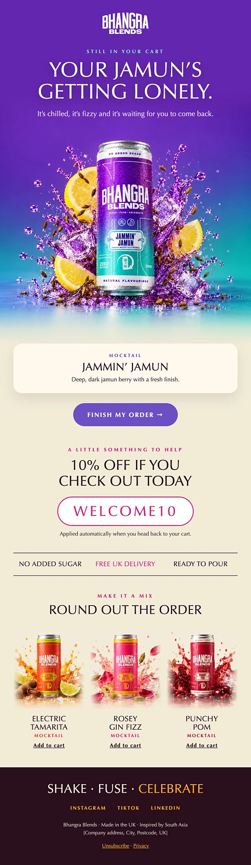
- "Your Jamun's getting lonely." It names the drink they left behind, so it reads like a nudge from a friend.
- One button. Finish my order, straight back to the cart.
- A reason to come back today. The 10% only applies if they check out today.
- Room to grow the order. The other flavours sit underneath as one-tap add-ons.
Note We only had your welcome email to compare against. If you already send a cart reminder, send it over and we'll add it here.
04 · Side by side
Today and new, together
Scroll either phone and the other follows.
At a glance
| Today | New | |
|---|---|---|
| First line | "Welcome to the blend." in light grey | "The search: mocktail that isn't boring" |
| The code | Small dashed box | Full-width pill with a button that applies it |
| Buttons | None, five text links | Six, one for each job |
| Flavours | Two pairs, one link per pair | Four rows, each with its own button |
| Product shots | Packshots on a flat block | Splash shots with the real ingredients |
| Last thing they see | A "Shop the blends" link | The cans and the code |